
Metro Taipei - Rebrand
Logo Animation
YEAR
2020
CLIENT
Metro Taipei
STUDIO
Bito
CREATOR
Hui Kai Su
ROLE
Art Director
捷運不僅是城市中的交通工具,更承載著都市人的日常生活,串聯不同的人、空間與故事,讓每一次移動都成為探索城市、交流資訊與汲取生活養分的契機。
我們將這個概念濃縮於短短三秒的動態識別中,透過極簡的動畫語彙與直覺的聲音設計,從列車行進、車窗與標誌中的負空間汲取靈感,呈現捷運穿梭城市的速度與節奏,同時象徵人與人之間持續流動的資訊與交流。
The metro is more than a transportation system. It carries the rhythm of urban life, connecting people, places, and experiences while creating opportunities for discovery and exchange throughout the city.
We distilled this concept into a three-second motion identity, combining minimalist animation with intuitive sound design. Drawing inspiration from moving trains, passing windows, and the negative space within the logo, the animation captures the rhythm of a metro journey while symbolizing the continuous flow of people, information, and ideas.
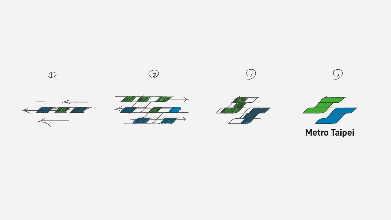
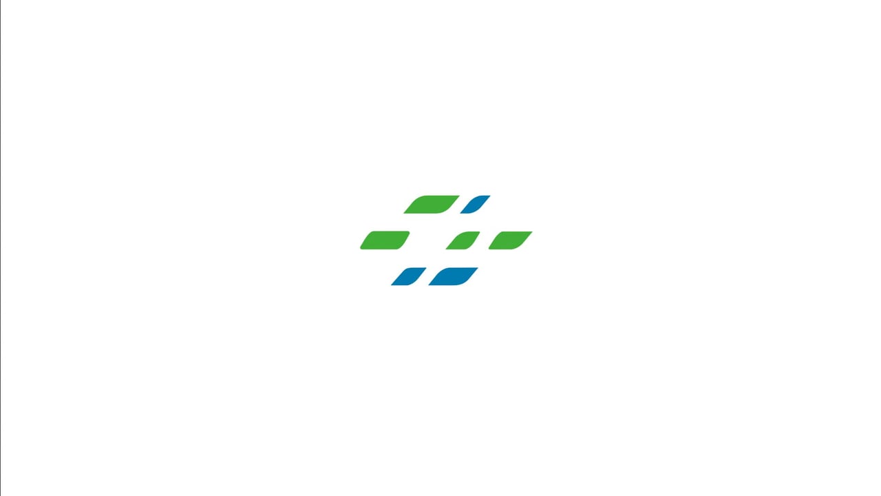
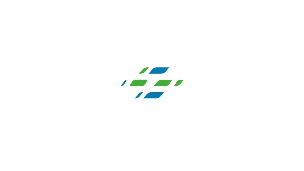
Storyboard
動態設計將 Logo 拆解為連續的線條,模擬列車快速行駛、進站後逐一停靠的律動。透過藍綠色塊交錯變化,呼應車窗掠過的視覺印象,進一步強化資訊流動與城市連結的概念,讓簡潔的品牌識別在短暫的時間內展現鮮明的動態個性。
By deconstructing the logo into a sequence of moving lines, we recreated the sensation of a train in motion, with each element gradually coming to a stop. Alternating blue and green window-like shapes introduce a sense of movement and exchange, transforming a simple logo reveal into a visual expression of urban connectivity.
Full Credits